Thursday, 9 June 2016

Evaluation

I What we did: We were tasked to produce a piece of work that is was going to be the pinnacle of the entire years worth of work that we did at NCN. So in short we were supposed to produce a piece of work that incorporates at least two of the three thing we learned here, for example the skills we learned here was photography, Film/TV and Graphic design. So anyone in the class can choose to do Photography with Film/TV or Graphic design with aspects of Photography and so on. Basically this entire endeavor was to allow the course leaders for the L3 and L2 courses to evaluate our work ethic and to see if we are capable to handle the stress of working independently away from lectures and other students. It is also to see if we are able start developing L3 standards of work, so we were allowed to make all of the choices ourselves when it come to the F.M.P, that includes whether doing Film, Photograph or Graphics.

What I'm doing: I personally chose to do Graphics with elements of Photography. I did this because I needed to bring up my skills in drawing because i'm wanting to go onto the L3 TV and Film this is because if im required to draw a sketch of the set/floor plan then it will be easily interpreted by other member of the group on where I want the props to be. The reason on why I also decided using some photography is because, unlike a picture that would remain still a live snake would move around while I would be drawing it, however that is not the only reason since it takes a trained professional to handle the dangerous snake I wanted I would have to do the sketches on site with the animal, also it isn't possible to have a snake in the class room
class since there would be dangers to the snake and to the other people within the class room

How will I do it: I will crate this piece of work through use of media programs used to edit and to create. These both are in the Adobe sphere of media tools, they Adobe Photoshop CC 2015 and Adobe Illustrator CC 2015. However before this I had to do some research first and then created some ideas through an hour of brainstorming.

Schedule:

This schedule shows the planning of the entire project from week 1 all the way to week 6. Currently there is a key above the schedule showing what I will be doing in class in black, outside of the class room in blue and any changes in red. With schedule this it helped me to keep to a form of time management.

How good was the research/Brains Storms: The first thing I did was brain storm some ideas for the final major product, it was probably the most difficult portion of the entire project because I had to make 8 ideas and describe them with a basic explanation. These rejected ideas were for back ups encase the original idea became to complicated to continue then I would have to fall back on one of the other ideasFor the research I have used both primary and secondary research so that I could make an informed choice on how to proceed with my choice, since I chose to do Graphic Design and blended it together with a small amount of Photography so I went to the library that is located on the floor below the normal class room. The reason behind this was to get some secondary research out the way and try and get some inspiration for my final design. I was looking along the different shelves to find anything on art styles of different cultures. I found the art style I was looking for, it was in a book called Art of Ancient Greece made by author J.J Pollit. This book has details of the different aspects of art made in the Archaic period so its to do with large building like the Greek Pantheon, paintings and stories.

What tools/programs did I use:


I started of with using physical tools to begin with before working with the digital ones, the explanation behind this was that with a pencil and ruler I could produce some good lightly drawn sketches. Then I would go over the sketches with a harder hand and applied more pressure on the drawing. After this I scanned the drawing into the computer as a JPEG file and imported it onto Photoshop. Then I used the paint brush tool and I had the size set to 10 just to go over the drawing in black paint to make the outline stand out as much as possible when I go and start adding the base colours to the drawing. After this I use  the quick select tool to add in and shading or highlight, this is because when painting in a shape made by any of the select tools the paint will never pass it, Also when adding the highlight and shadowing I used ether a size 6 brush or a size 30 brush with each having the hardness set to 100%. For the center snake I did the same process but instead of using physical tools I went straight to the use digital tools and used the Adobe Illustrator to create the body and head. Finally I had to use Illustrator  to create the smoke effect I wanted so I created 3 intertwining lines with the ends close together but not touching, after this I made the thickness for all 3 lines around about 0.5 this left the lines in a super thin state, then I doubled the original number of lines to 6  and dragged and dropped all of the lines into the brush selector  and did 4 strokes and changed the colour from black into a white/grey combination. After this I imported the newly created smoke vectors into the final design that was almost done in Photoshop and placed the smoke vectors at the bottom of the image. Then once the smoke vectors are placed I blurred the layer that I placed the smoke vectors on and smudged it so it appeared transparent and has the same texture as smoke. 


What can be Improved and what went wrong:

The things  that went wrong in this project was that the middle snake looked to 2D so thanks to some peer feedback I was able to make it look more 3D. This happened through a process of shading and altering the original sketch. One of the things that went wrong with this final design would the time management since there wasn't enough time to do the third and final design in any detail so to get around this I used the puppet tool to change the trajectory to make the third snake to look different.

What changes will I do next time:
The changes I will make  would be the background and instead of a basic black background, I will change it into a hill side background or a mountain face.

How did it feel to finish the F.M.P and have it displayed:
After the entire project was done and the final design was printed off and placed on the gallery wall I felt a an extreme sense of pride in being done and it made me realise that I had a blasted creating im creating what is supposed to be the best out of all the work that I had already done.


Monday, 6 June 2016

Survey Monkey and the Influances on my Design


These response will allow me to alter my original plans for the final piece, For example the first question I asked was 'How would you react after seeing a monster'. The responses I got from the servery was near enough the same with the response being 'Run Away/Pass out' so this influenced my design by making it look scary and overbearing. However if they did say that they would do something heroic then i'll add a hero character above the hydra to show dominance over the creature. The next question I asked was 'Would you save a fellow human from a monster', this question was to show if human would be brave enough to face the monster, depending on their answers this would have repercussions in my final design by having it sealed away or by having it to roam free. The reason why this would happen is because if humans stuck together they could achieve anything while if they abandon each other to save themselves then they won't achieve anything. So the general conciseness is that they will if there important however it was a question about just a random person so there will be a seal on it however there will be a lake of blood below the monster, so it shows that it took a lot of bodies to seal away the monster. After this the other questions were just asking the age range of the participants. I did this so I could   

Thursday, 19 May 2016

Peer Evaluation

Callum C Burrows : Shading I suggested to Sam that his shading needs a little improvement because it did not look realistic. it looked too cartoony. I said why don't you add more shades of different colours of the same shade and use the blending tool to blend it all together to get the 3D look that he wanted I also suggested to make highlights with white so it looks like sliver.

Daniel Semakula: I think it needs to be more out in the open and not constraint, so you could achieved this by changing your background from a simple black to a more vibrant choice like a meadow or a more realistic approach by having the background a swamp or something along those lines.

Simeon Gordan: Its good piece of work for an end of year work because it shows your base concept with superb clarity however the execution was poor since its looks 2D and the high lights and shadows looked rushed.

Tuesday, 10 May 2016

Steps to final design

 1st: The first step of the final design the snake and then scan it into the computer and then to highlight the lines i went over them in a black paint brush to make the grey lines stand out since all of the grey was to light to add any colour.
 2nd: After the first step I did the base colours of the snake since I couldn't correctly fit the texture of the snake skin onto my drawing also the texture was way to dark since it masked over the outline of the drawing so i decided to use a grey colour to provide a smooth skin look.
 3rd: As you can see this part was about the insides of the snakes so I started out with using basic techniques on the smaller image, until I had some help from another class mate on the actual shading inside a mouth that would show more of a fluidity effect towards the end of the mouth. The main tool I used for this step is the brush tool with a its size set at 10 and a quick select tool that has been set to the same size as the brush. This will allow me to apply colour within the selected area made by the quick select tool. The tool is shown below the picture on the left.
4th: The fourth step I added special features after the shading, this is the final step of developing the final image. The only thing I need to develop now would be the black background

Monday, 25 April 2016

Research

Mythological Back Story:
The Hydra was a gigantic, nine-headed water-serpent, which haunted the swamps of Lerna. Hercules was sent to destroy her as one of his twelve labours, but for each head that had been decapitated, two more sprang forth. So with the help of Iolaos, he applied its own acidic venom to the severed stumps, cauterizing the wounds and preventing regeneration. In the battle he also crushed a giant crab beneath his heel which had came to assist Hydra. The Hydra and the Crab were afterwards placed among the stars by Hera as the Constellations Hydra and Cancer.

Snake Research/Considerations:

The considerations I would need to take account would be personal safety since the striking distance of any snake is double its body length so I would need to stand at a distance outside of its striking distance, also I will need an employee to handle the snake for safety measures. Then I need to have the flash of the camera turned off since i would run the risk of blinding it. I had to find this through a mixture between an actual photography website and a personal friend since she didn't know all of the information that I needed. 

Snake References/Research:
Snake-1


These are the reference images that I have had to pick off the internet 


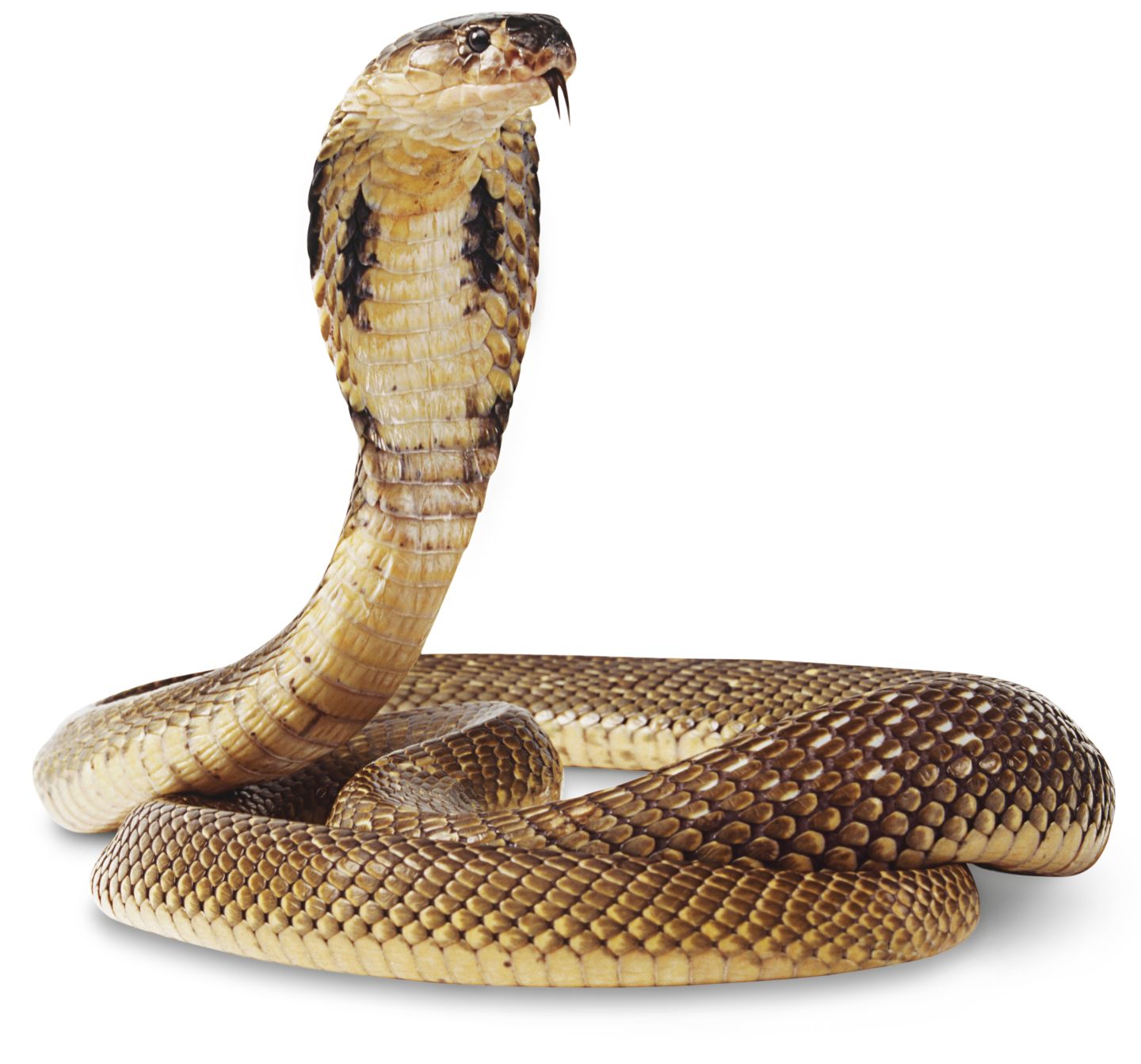
Snake- 2: This snake is called a cobra unlike the other type of cobra that are called king cobras the common cobra has a different colour skin since the regular cobra only has light coloured scales while the king variant has black scales. Another difference of the two snakes is the size they grow up to for example the common cobra can grow up to 5.5 feet while the king cobra can grow up to 15 feet and the hoods that both of them have are different because the common variant has a large hood while the king cobra has a narrow hood. 


Survey Monkey:

In my primary research I decided to incorporate a qualitative aspect to my survey, since I had the survey made to make the participants to give more than a 'closed' answer. For example for the first question I asked the participant was 'how would you react after seeing a monster'. The responses that were given were different for each person however they all said the same thing that was that they would be scared, running away etc.      


Box Art for Different Games:

I enjoyed the typography they used for this box art since it is reminiscent of street lights with the way it shines down onto the origami bird. I didn't like the age rating, the developers and the publishers are all at the bottom so it obscures the image.Maybe i will imperilment this type of design by having all of the text near the top.

Reference: Heavy Rain


What I like: I liked the way they seemed to create the title with a brush technique within photo-shop, also the creators had a good idea with the clouds. I dislike the the main character standing in the middle of the box art, they could of had the main character only showing half of himself and as it get to the edge of the box he cloud slowly dissolve into the shadows, then all of the visible areas showing the tattoo that is currently shown on the image to the left. I'll probably use the brush technique for the title or logo.    
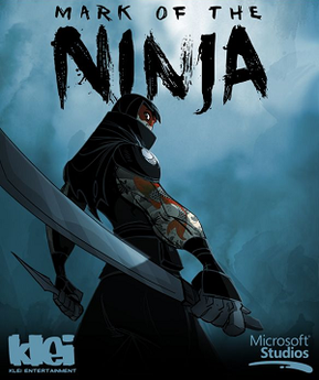
ReferenceMark of the Ninja


Art Styles:
The three art styles that relate to my final design, the first is Cubism. Cubism is a style of abstract art, it was popularized by artists such as Pablo Picasso and Georges Braques. Not only was it a form of abstract art it was the first of the genre where all of the art work was done with shapes. This will help me in my final design since it would be easy enough to do since it would rely on shapes to make it look nice, so for example I could make the Hydra out of folded cubes and rectangles. Secondly is Expressionism, this is where piece of creative work such as music, art and literature and imbued with emotions of the artist. If i decided to add this into  my work I would try and make the atmosphere as somber and as hopeless as possible. Finally the last one is  Post-Impressionism. Post-Impressionism is nether a formal movement or a new art form and any artist that did do it are far and few between. These artist rebelled against the restrictions of Impressionism, when it was inducted into the mainstream audience. They did this by adding emotional structure as well as symbolic and spiritual meaning. To be honest I don't believe I will incorporate this design into my final project.   
 References

Schedule

Key:
Writing that is in black are the things i'm doing in class, while blue will be actives outside of class and finally red are things that I needed to change/alter
Week 1:
What I will be doing in class this week is brainstorming and research. Outside of the classroom of the classroom I will be looking into different art styles and asking a close friend of mine to be able to take images of her Reptiles for reference. I had to change the way I will get the reference images by phoning up a couple of pet stores such as Supapet and hopefully start taking the images of the different Reptiles next week. I've finally got a hold of the person I was originally going to for the snake images. It seems they had changed their mind and I can no longer get an appointment with any pet shop so I will have to settle with images online.  

Week 2:
In this week during the time I am in class I will be perfecting my proposal by having the tutors read through it and having them give me feedback on how to improve it. While Outside I will be taking images of the different Reptiles and start drawing a rough sketch for my final design as well as my banner and logo. There is nothing to change at the moment. The initial rough design I made didn't come out life-like enough so I had to recreate it.

Week 3:
I will be in the final stages of pre-production and will be starting the actual production. Outside of the classroom I will be doing some basic sketches and designing the logo/banners. 

I've focused on just creating the snake heads since it will take it took the most amount of my time so I will need to finish the rest of of the remaining items for week 4. 

Week 4:
In this week I will be finishing production/post production. I will be typing up the process of making the production, such as steps and finishing touches. I had to change the shading on the final designing and the background for a more simplistic design.

Week 5:
This week I shall create a presentation to show how I progressed through this project with slides to do with research, creation and inspiration. I shall do some rehearsals for showing the presentation on Thursday for tutorial. I had to change some slides to cut down on time because originally the time taken to talk about each slide was averaging around 25 minutes, so I managed to get it down to 18 minutes.    

Week 6:
The evaluation was the final thing to do and is closest to the end of the year so I had to put all of my effort into it since it will be the final push. While outside of the classroom I will be going over previous work and spell checking the evaluation. 

Thursday, 21 April 2016

Brain Storm


Idea 1:
In this idea I was planning on going to different key places within Nottingham and take image of them, then place all of the compiled images onto Adobe Premier Pro and have them line up into a skeleton edit then have a voice over explaining whats going on. I didn't do this since there aren't many images dating back ages ago so I couldn't compare each location of today with it's time way back when.

Idea 2:
This one was going to be a poster for an Fantasy Adventure movie with a  a dagger in a map and a single coin pouch, so this would show the movie has exciting large scale battles which was represented with the dagger  and a potential antagonist in a form of a bounty hunter. The reason why I didn't do this is because that it seems too tamed and it wouldn't push my skills in the Illustrator portion of this entire course.

Idea 3:
This one was going to show the beauty of nature and how it will maintain to look if we had more nature reserves, and how use human have effected the landscape indefinitely. The image was going to have three different images, the first would be having the land shown from a point of origin(Trees, tall grass and uncluttered rivers etc.) then the second image would be little changes such as fences and finally it would be a town. I didn't do this because of the equipment needed as well as the concerns with the safety of the equipment since there aren't many stable places within my local nature reserve.

Idea 4:
This idea was to add to my Graphic design skills by making a banner/logo for a website on the environment since will allow me to discover new techniques through self research. The image was going to show a few trees in winter time and the snow on the ground however I couldn't do this since it was spring/summer time and to get any reference image that was not shot by myself would be nigh impossible.


Idea 5:
This one i will be making a character design of a mythological monster  and adapting it to fit in the slim time frame placed on this task so one of the ways i'm going to  adapt is by having the number of heads reduced. This will be my main idea I will be developing on, so I will begin researching this as soon as possible. I would also need to take into other considerations but they can be sorted by the time I've research all of the information needed.

Idea 6:
This idea will get me back to basics on photography by having myself photograph an inanimate object and use it to create a product made by a company, also it will improve my voice acting work since it will be like an professional advert. However I have no interest in doing anything to do with adverts since I'm wanting to move into a L3 film and TV course.

Idea 7:
This idea will be a trailer for a movie, I had this idea because since i'm wanting to do a L3 TV and Film course for the next 2 years so it'll push my skills to provide some good camera work and some excellent framing. It will also use my editing skills since I need to have some visual effects that are royalty free. Sadly I didn't pursue this idea because its to ambitious at this point in time.

Idea 8:
Idea 8 was to include graphic design and the art style would be cyber punk which is an interesting premise to go with. Sadly it would require me to produce multiple character drawing of the same person and the basic drawing i'm wanting to do is to complex.

Tuesday, 19 April 2016

Proposal

Proposal
I want to do a character design based around the mythological beast called a hydra. I would like to do this because of its the most interesting when compared to the other monsters within the mythological lore of ancient Greece, since to kill the beast you have to chop off one its head then use its own venom to kill it.


What I will create 
I'm wanting to create a three headed hydra since I will be able to create each head in detail in order to keep within the time frame set by this project because if I did the regular nine headed hydra then I wouldn't be able to get to a high enough standard that would reflect my time in doing this course probably. To create this I will be using photography to take reference images using a friends pet animal which are a Rhino Snake and a Grass Snake with these images I would have good enough references to work off since I would be shoot these animals at different angles and changing the light source to find out how it will look in different shadows etc. The research I will be doing will be Primary and Secondary Research as well as Quantitative Research. These will be things such as using the local library for Secondary Research, taking notes and image of real life snakes and using Survey Monkey to find what atmosphere I should portray. The techniques I will be using will be using a three point lighting system for the Photo shoot of the snakes and using a wide aperture with a low ISO on important features as well as using vectors on Adobe Illustrator for the creation of smoke in the final design.

Photographic Considerations
The variables I will have to take into account will be the best/worst case scenario. So the variables for the best case scenario would be that a employee/Friend would handle the snake while I would start taking images of the animal at different angles, combine that with bright light sources and the low ISO as well as a small aperture and I would have some detailed reference pictures. However if the bad case scenario were to happen I would be using a slightly lower ISO and a wide aperture this will allow as much light to get into the camera since there will be barley any light on the snakes. I won't be using any flash since if I was to do it too often then the snakes would go blind.  Therefore to provent this I would place them in as much light as possible to get the best shot without risking the well being of the animal.
Lighting-Out of case
Low ISO in good light/High ISO in bad light

Process of creating the Hydra 
The first Step in my process on creating the Hydra is to open up a JPEG file on Illustrator that is one of the reference image I took earlier in the project and have that as an outline for the base body. Then I will sketch out the more detailed aspect of this particular design such as scales the mouth and any battle damage suffered. Then I will be have a land mass form around it to show the hydra is in a hole with smoke coming out. I will be creating the smoke via Adobe Illustrator using vectors which can be found on the piece of software. Then I'll show the final design to other members of the class to get some feedback on the image and change the area that needed improvement. After this I will make a banner above the monster and have it warp around the hydra to try and malice, so I will be mainly using dark reds and purples. This banner will be the name of the game and I will be doing the design of a logo after the main body of the work is complete.

What I'm Doing.

  • Hydra coming out of an abyss.(Illustrator)
  • 3 heads
  • I will be using a texture to save time
  • Basic snake as a model for the head
  • Light coming down for the top
  • Name of game
  • Logo  


Rhino Snake


Snake Sink Texture
Grass Snake


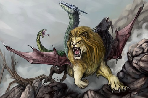
This is a video on what I'm wanting it to look like. Hydra (Dark Souls). You'll have to skip to the until its 8 minutes and 20 seconds in. Also all of the images below are different artist renditions of the Hydra and other Greek mythological beasts.
Minotaur


Chimera


Hydra